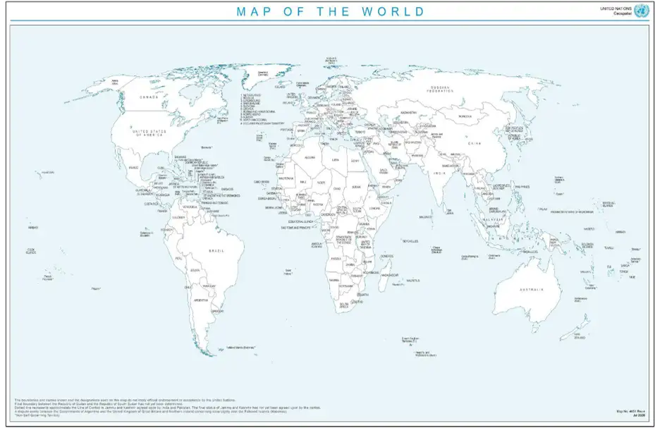
For centuries, the world map displayed in classrooms, textbooks, newspapers and government offices has shaped the way people understand our planet. But what if the familiar image of the world is misleading us? In a landmark decision, the United Nations General Assembly has taken a significant step towards addressing distortions in commonly used world maps, particularly the famous Mercator projection, which can dramatically misrepresent the relative sizes of continents and countries.
The General Assembly adopted the resolution “Correct the Map: Rebalancing Global Cartographic Representation and Promoting Equitable Representation of the World’s Regions, Particularly Africa” with overwhelming support. The resolution received 164 votes in favour, while the United States voted against it and six countries, Estonia, Georgia, Lithuania, the Republic of Moldova, Serbia and Ukraine – abstained. The initiative calls for wider consideration of equal-area map projections, particularly the Equal Earth projection, in situations where accurately comparing the size of continents is important.
The issue may appear to be simply about geography and cartography, but supporters argue that it has much deeper implications. Maps influence education, public understanding, cultural identity, geopolitics and even perceptions of the importance and potential of different regions. For generations, the way continents have been visually represented has influenced how people imagine the world and their place within it.
The most familiar example is the Mercator projection, created in 1569 by Flemish cartographer Gerardus Mercator. Interestingly, Mercator never designed his map to accurately compare the sizes of continents. His projection was primarily created to help sailors navigate the oceans because it allowed them to follow straight-line routes using a compass. For maritime navigation, it was revolutionary.
However, the Mercator projection came with a major mathematical limitation. As locations move farther away from the equator towards the North and South Poles, they appear increasingly larger. This means regions such as Europe, North America and Greenland can look much bigger than they actually are, while countries and continents near the equator can appear significantly smaller.
Africa is one of the clearest examples of this distortion. On many traditional world maps, Africa appears comparable in size to other major landmasses. In reality, Africa is enormous, large enough to contain the United States, China, India and much of Europe. Yet the traditional Mercator-style representation often fails to communicate the continent’s true geographical scale.
The history of world maps reveals that maps have always reflected more than geography. Some of the earliest known maps were created by ancient Babylonian civilizations. Greek scholars, including Ptolemy, later developed important systems for representing the Earth using latitude and longitude. During the medieval period, maps often reflected religious beliefs and cultural perspectives rather than geographical accuracy.
As European exploration expanded across the oceans, maps became increasingly important for navigation, trade, territorial expansion and political influence. Cartography became closely connected with power. Countries that produced maps could define territories, establish trade routes and shape how distant regions were understood by people who had never visited them.
This historical context is one reason why the UN resolution describes the issue as involving cognitive justice, historical recognition and equitable representation. Supporters argue that when certain regions are consistently shown as smaller or less prominent, it can subtly influence how generations understand their importance in the world.
However, the resolution was not accepted unanimously. The United States was the only country to vote against the proposal. Its representative argued that although the resolution was presented as an effort to improve cartographic representation, it was connected to broader ideological debates and added unnecessary complexity to the work of the United Nations.
Ukraine also raised serious concerns, although it did not oppose the broader principle of more accurate geographical representation. Ukraine objected specifically to the Equal Earth map referenced in the resolution, arguing that the depiction of territories temporarily occupied by Russia was unacceptable and inconsistent with previous UN positions regarding Ukraine’s internationally recognized territorial integrity. Ukraine was among the countries that abstained from the vote.
Meanwhile, the European Union supported the objective of promoting more equitable and accurate cartographic representation, particularly regarding Africa. However, it emphasized that the resolution should be understood strictly in the context of education, awareness and geographical literacy and should not affect questions relating to sovereignty, borders or territorial disputes.
The resolution encourages the use of alternative projections when geographical area matters. The Equal Earth projection, developed in 2018, is one such alternative. It is designed to preserve the relative areas of continents and countries more accurately while maintaining a visually recognizable representation of the world.
Of course, no flat map can perfectly represent a spherical planet. Every map projection involves compromise. Some projections preserve shapes, while others preserve distances, directions or areas. The Mercator projection remains extremely useful for certain purposes, particularly navigation. The debate is therefore not about declaring one map completely correct and another completely wrong,it is about choosing the right map for the right purpose.
The UN initiative asks an important question: How should future generations learn to see the world? If students are studying geography and comparing the physical size of continents, an equal-area projection may provide a more accurate perspective than a navigation-focused map created more than 450 years ago.
The General Assembly’s decision came alongside several other international initiatives, including measures supporting multilingualism and the proclamation of the International Decade of Culture for Sustainable Development (2027–2036).
Perhaps the most powerful message behind the “Correct the Map” initiative is that geography itself has not changed. Africa has always been the same size. Greenland has always been much smaller than it appears on many classroom maps. The continents did not change—but the way humans chose to represent them did.
A map may seem like a simple picture of the world, but it is also a powerful tool that shapes perception. The UN’s latest initiative reminds us that sometimes changing the way we see the world can be the first step towards understanding it more accurately.
The world has not changed. But perhaps it is time to change the map through which we see it
Source: https://press.un.org/en/2026/ga12779.doc.htm